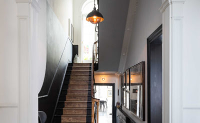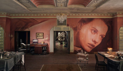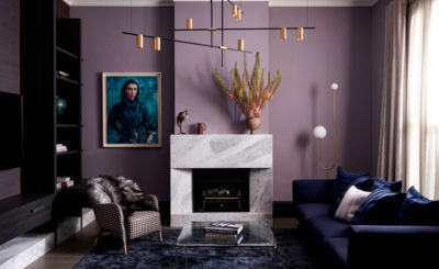
The Stylesmiths Project: Matlock Residence is all about loving colour, featured in the March 2018 Real Living Magazine.
Known as The Matlock House, the clients are a young family that felt their furnishings, surfaces and fixtures were outdated – wanting to create a fresh look with more personality, colour, elegance and style.
“We’ve seen white. We’ve seen neutrals. We’ve seen splashes of greenery and a hefty dose of millennial pink. But rarely do we see such an abundant and joyful use of colour as in the Matlock residence,”
says Real Living’s Sarah Tarca.

Lead Designer Styesmiths Danielle knew when she began designing that it was important to refresh the surfaces, lights and furnishings but integrate some of the original pieces and art works that have sentimental family value. With an eye for colour, which our clients love, Danielle set to work on injecting the inspirations of the eclectic New York apartment from model Carmen Dell’Orefice; artistic, chic but not too precious.
“Our clients love colour, and Danielle knew they would be very receptive to a palette that incorporated a broad spectrum of colour throughout,” Richard Misso, The Stylesmiths.

Pictured above the incredible side cabinet by Grazia&Co, the dining chairs by Thonet and the stunning “Vertigo” light feature by Constance Guisset.
Painted in different shades, including a dusty pale pink, navy and violet blue tones, it was important to create a unique monochromatic feel in each room to give the space a distinct feel and atmosphere. Danielle re-upholstered some well loved art deco chairs in a lush bottle green velvet and re-fashioned the circular dining table with Black Japan lacquer and a black glass table top. The furnishings and lighting of the space create a strong contrast of tones, layering & keying the space with deep greens, navy, black, gold and magenta.
Danielle shares her colour theory with us and Real Living on page 24 below, including how to craft the perfect palette in your own home.

START WITH THE BIG PICTURE:
It’s important to look at the house scheme as a whole. I create a spread of swatches, fabrics and materials throughout the home to ensure that the balance is there.”
KEEP IT IN HARMONY:
Once the broader scheme is established, you can create more complex combinations within each room. I don’t want anything jarring as you travel between spaces. I prefer it to unfold and tell a story.”
BE BRAVE:
There is no limit on how many colours you can use in a home. I love both gentle and strong combinations – just be true to what you love. And remember to keep the whole scheme in mind, taking into account all the colour elements.
FEELING A TAD COLOUR SHY? START SMALL:
Just start with one colour that you love and then build a colour scheme around it. Don’t worry too much about trends.

The end result is a sensory delight of colours that are rich with complimentary layers, and once the inspirations are resolved within the scheme of swatches, fabrics and materials, there is opportunity to zero in on the individual spaces and create more complex colour combinations in each room.


