Sometimes they’re vertical, most of the time symmetrical: lines, stripes, zig-zags, squiggles, and even crossed patch work is making a resurgence in design. First possibly introduced to the runway by Gabrielle ‘Coco’ Chanel, inspired by sailors attire built for practicality, she introduced a nautical collection in 1917 – stocked in her boutique at a wealthy holiday retreat of Deauville in Normandy. In your wardrobes you’ll still find stripes today, perhaps because of it’s timeless elegance, but too for it’s bold capabilities.

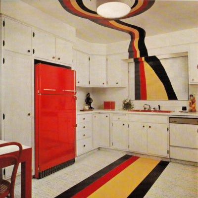
Design has found it’s place for stripes in many different decades. The 70’s took us into the Decorating With Confidence era, the image below of the same title by Jose Wilson & Arthur Leaman, captured in 1973. Bold colours were emphasised then matched with lined shapes that flowed from different surfaces, textures, even to the ceilings. As the title suggests, it’s a confident addition and style choice to add feature walls with zebra like lines, but the transition it’s making into our modern lifestyles today is quite soothing.

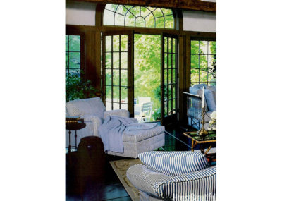
We saw in the 80’s too this trend became further refined. As style continued to change, radical colours were mixed with colonial styled kitchens, cutlery & fine china, with living areas inspired by Memphis Milano. The 80’s were known for the calm in the midst of madness and somehow with bright spaces, geometric shapes combined with patterns and stripes (all crazy on the eyes) it actually calmed within its abstraction. Stripes particularly became preppy and thinned, almost always in a blue nautical style, featured below from the Ralph Lauren Home Furnishings range, debuting in 1983.

We did see the thrown together comforting looks from the 80’s too, labelled as the shabby & cottage chic design, but what we’re most excited for is seeing how modern design is transforming these trends. Manipulating the visual experiences in both residential and hospitality, spaces are being designed for interaction, then stimulation. Stripes thus are being reimagined, with opaque levels leading into harsh lines, before continuing again to the next. Diagonals that only reach half of a feature wall that make a dramatic stop. Walls, decorations, rugs and bed spreads still have lines stretched across them, but now they’re being widened into thicker featured patterns.
A returning trend of Japanese Zen, seen in the 80’s, is surging at the moment also. The simplicity of architectural lines, balanced for comfort with clean colours as one dramatic feature, is then carefully constructed and applied to be uniform, subtle, and unique to sooth your spirituality. In its complete juxtaposition of the calm against the bold stripes: a beautiful, adventurous and modern interior has been created. Look through our examples below that play with stripes, geometry, colour, the lot and let us know in the comments what you think of this return?